> ## Documentation Index
> Fetch the complete documentation index at: https://docs.tinykit.studio/llms.txt
> Use this file to discover all available pages before exploring further.
# Design System
> CSS variables and visual theming
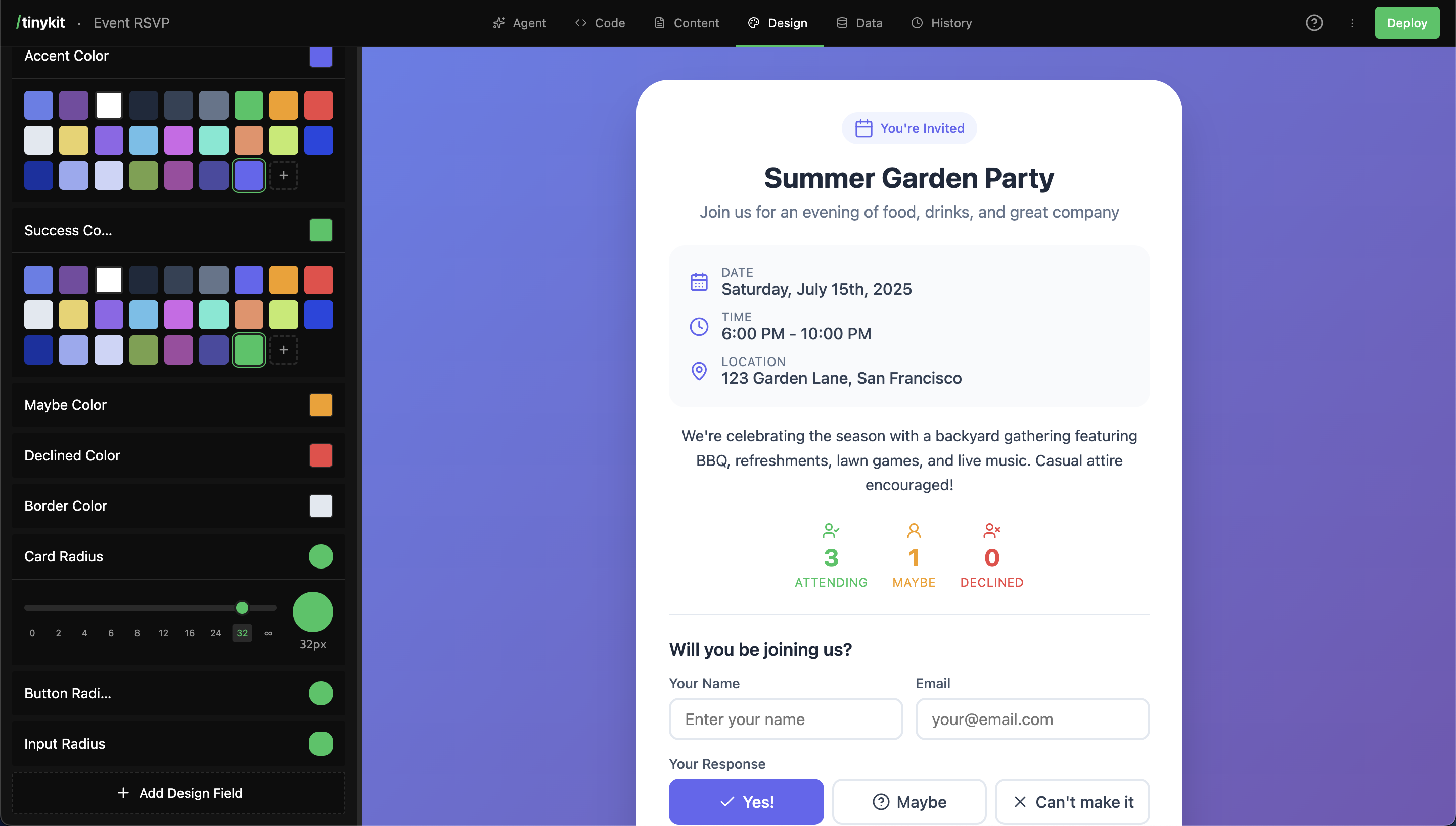
Design fields are CSS variables that control your app's appearance. Colors, fonts, spacing, shadows—all adjustable with visual editors, no code required.
## How It Works
1. The AI (or you) creates a design field with a name and value
2. The field gets a CSS variable (e.g., `--page-background`)
3. Your code uses the variable: `background: var(--page-background)`
4. The Design tab shows visual editors for each field type
5. Changes update the preview instantly
```
Design Tab Your CSS
┌─────────────────────┐ ┌─────────────────────┐
│ Page Background │ │ .page { │
│ ┌───┬───┬───┬───┐ │ → │ background: │
│ │ 🔵 │ 🔴 │ 🟢 │...│ │ │ var(--page- │
│ └───┴───┴───┴───┘ │ │ background); │
└─────────────────────┘ │ } │
└─────────────────────┘
```
***
## Field Types
Each type has a specialized visual editor:
| Type | Editor | Example Values |
| ---------- | ------------------------- | --------------------------- |
| **color** | Color palette picker | `#3b82f6`, `#ffffff` |
| **size** | Slider (0-96px) | `16px`, `24px` |
| **font** | Font picker (1000+ fonts) | `Inter`, `Playfair Display` |
| **radius** | Radius slider | `8px`, `9999px` (full) |
| **shadow** | Shadow presets | `0 4px 6px rgba(0,0,0,0.1)` |
| **text** | Plain text input | Any custom value |
***
## Using Design Fields
### In Your CSS
Always include fallback values:
```css theme={null}
.card {
background: var(--card-background, #ffffff);
border-radius: var(--card-radius, 8px);
box-shadow: var(--card-shadow, none);
}
.heading {
font-family: var(--heading-font, sans-serif);
color: var(--heading-color, #1a1a1a);
}
body {
font-family: var(--body-font, system-ui, sans-serif);
font-size: var(--body-font-size, 16px);
background: var(--page-background, #f5f5f5);
}
```
Always use fallback values: `var(--name, fallback)`. This ensures your app works even before design fields are created.
### Name to CSS Variable
Field names are converted to kebab-case CSS variables:
| Field Name | CSS Variable |
| ----------------------- | --------------------------- |
| Page Background | `--page-background` |
| Card Border Color | `--card-border-color` |
| Button Hover Background | `--button-hover-background` |
| Body Font | `--body-font` |
***
## Color Fields
Color fields use a palette picker with:
* Quick-select color chips
* Full color picker
* Hex input
* Theme colors (other colors in your project)
### Common Color Fields
```css theme={null}
/* Page colors */
--page-background: #f5f5f5;
--card-background: #ffffff;
/* Text colors */
--heading-color: #1a1a1a;
--body-text-color: #333333;
--secondary-text-color: #666666;
--muted-text-color: #999999;
/* UI colors */
--accent-color: #3b82f6;
--border-color: #e5e5e5;
--hover-background: #f0f0f0;
/* Semantic colors */
--success-color: #22c55e;
--warning-color: #f59e0b;
--danger-color: #ef4444;
```
### Using Colors
```css theme={null}
.header {
background: var(--header-background, #ffffff);
border-bottom: 1px solid var(--border-color, #e5e5e5);
}
.button {
background: var(--accent-color, #3b82f6);
color: #ffffff;
}
.button:hover {
background: var(--button-hover-background, #2563eb);
}
```
***
## Font Fields
Font fields include a picker with 1000+ fonts from [Bunny Fonts](https://fonts.bunny.net/):
### Popular Fonts (Quick Select)
| Font | Category |
| ---------------- | ---------- |
| Inter | Sans-serif |
| Roboto | Sans-serif |
| Open Sans | Sans-serif |
| Poppins | Sans-serif |
| Montserrat | Sans-serif |
| Playfair Display | Serif |
| Merriweather | Serif |
| JetBrains Mono | Monospace |
| Source Code Pro | Monospace |
### Using Fonts
```css theme={null}
body {
font-family: var(--body-font, system-ui, sans-serif);
}
h1, h2, h3 {
font-family: var(--heading-font, var(--body-font, sans-serif));
}
code, pre {
font-family: var(--code-font, ui-monospace, monospace);
}
```
Chain fallbacks for fonts: `var(--heading-font, var(--body-font, sans-serif))` uses the body font if no heading font is set.
***
## Size Fields
Size fields use a slider from 0-96px. Good for:
* Font sizes
* Spacing (padding, margins, gaps)
* Icon sizes
### Using Sizes
```css theme={null}
.container {
padding: var(--container-padding, 24px);
gap: var(--card-gap, 16px);
}
.heading {
font-size: var(--heading-size, 32px);
}
.body {
font-size: var(--body-size, 16px);
}
```
***
## Radius Fields
Radius fields control border-radius with a visual slider:
* `0px` = square corners
* `8px` = subtle rounding
* `16px` = noticeable rounding
* `9999px` = fully rounded (pill/circle)
### Using Radius
```css theme={null}
.card {
border-radius: var(--card-radius, 8px);
}
.button {
border-radius: var(--button-radius, 6px);
}
.avatar {
border-radius: var(--avatar-radius, 9999px); /* circle */
}
.input {
border-radius: var(--input-radius, 4px);
}
```
***
## Shadow Fields
Shadow fields offer preset options:
| Preset | Value |
| --------- | --------------------------------- |
| **None** | `none` |
| **SM** | `0 1px 2px rgba(0,0,0,0.05)` |
| **MD** | `0 4px 6px rgba(0,0,0,0.1)` |
| **LG** | `0 10px 15px rgba(0,0,0,0.1)` |
| **XL** | `0 20px 25px rgba(0,0,0,0.15)` |
| **Inner** | `inset 0 2px 4px rgba(0,0,0,0.1)` |
### Using Shadows
```css theme={null}
.card {
box-shadow: var(--card-shadow, 0 1px 2px rgba(0,0,0,0.05));
}
.modal {
box-shadow: var(--modal-shadow, 0 20px 25px rgba(0,0,0,0.15));
}
.input:focus {
box-shadow: var(--focus-shadow, 0 0 0 3px rgba(59,130,246,0.3));
}
```
***
## Creating Design Fields
### Via the AI
The AI automatically creates design fields when building your app:
```
Create a card component with customizable colors and rounded corners
```
The AI will:
1. Write CSS using variables with fallbacks
2. Create design fields for each variable
3. Fields appear in the Design tab
### Via the Design Tab
1. Click **Add Design Field** at the bottom
2. Choose a type (color, size, font, etc.)
3. Enter a name (e.g., "Card Background")
4. Set the initial value using the visual editor
5. Click **Add Field**
### Workflow: Design Then Code
If you create design fields first, then write CSS:
1. Add "Card Background" as a color field, set to `#ffffff`
2. The CSS variable `--card-background` is now available
3. Use it in your CSS: `background: var(--card-background, #ffffff)`
***
## Best Practices
### Use Descriptive Names
* Card Background
* Header Text Color
* Button Hover Background
* Container Padding
* Primary Color
* Color 1
* Background
* Size
### Consistent Naming Patterns
```
[component]-[property]
card-background
card-border-color
card-shadow
card-radius
button-background
button-hover-background
button-text-color
button-radius
```
### Start Minimal
Don't create every possible field upfront. Let the AI add fields as needed, or add them when you actually need customization.
A simple app might have 5-10 design fields. A complex app might have 20-30.
### Dark Mode Pattern
Create paired light/dark fields:
```css theme={null}
:root {
--page-background: var(--light-page-background, #ffffff);
--text-color: var(--light-text-color, #1a1a1a);
}
:root.dark {
--page-background: var(--dark-page-background, #1a1a1a);
--text-color: var(--dark-text-color, #f5f5f5);
}
```
***
## Organizing Fields
Design fields appear in the order they're created. Group related fields by creating them together:
```
1. Page Background
2. Card Background
3. Header Background
(backgrounds grouped)
4. Heading Color
5. Body Text Color
6. Secondary Text Color
(text colors grouped)
7. Accent Color
8. Border Color
(UI colors grouped)
```
***
## FAQ
Yes! Click the pencil icon on any field to edit its name and type. The CSS variable will update automatically.
The CSS will fall back to the default value you specified: `var(--deleted-field, fallback)`. Always use fallbacks.
Use the "Custom" (text) field type and enter any font-family value. You'll need to ensure the font is loaded via a `` tag or `@font-face`.
Reference one variable from another:
```css theme={null}
--button-background: var(--accent-color, #3b82f6);
--link-color: var(--accent-color, #3b82f6);
```
Yes, read CSS variables with:
```javascript theme={null}
const color = getComputedStyle(document.documentElement)
.getPropertyValue('--accent-color')
```
 ## How It Works
1. The AI (or you) creates a design field with a name and value
2. The field gets a CSS variable (e.g., `--page-background`)
3. Your code uses the variable: `background: var(--page-background)`
4. The Design tab shows visual editors for each field type
5. Changes update the preview instantly
```
Design Tab Your CSS
┌─────────────────────┐ ┌─────────────────────┐
│ Page Background │ │ .page { │
│ ┌───┬───┬───┬───┐ │ → │ background: │
│ │ 🔵 │ 🔴 │ 🟢 │...│ │ │ var(--page- │
│ └───┴───┴───┴───┘ │ │ background); │
└─────────────────────┘ │ } │
└─────────────────────┘
```
***
## Field Types
Each type has a specialized visual editor:
| Type | Editor | Example Values |
| ---------- | ------------------------- | --------------------------- |
| **color** | Color palette picker | `#3b82f6`, `#ffffff` |
| **size** | Slider (0-96px) | `16px`, `24px` |
| **font** | Font picker (1000+ fonts) | `Inter`, `Playfair Display` |
| **radius** | Radius slider | `8px`, `9999px` (full) |
| **shadow** | Shadow presets | `0 4px 6px rgba(0,0,0,0.1)` |
| **text** | Plain text input | Any custom value |
***
## Using Design Fields
### In Your CSS
Always include fallback values:
```css theme={null}
.card {
background: var(--card-background, #ffffff);
border-radius: var(--card-radius, 8px);
box-shadow: var(--card-shadow, none);
}
.heading {
font-family: var(--heading-font, sans-serif);
color: var(--heading-color, #1a1a1a);
}
body {
font-family: var(--body-font, system-ui, sans-serif);
font-size: var(--body-font-size, 16px);
background: var(--page-background, #f5f5f5);
}
```
## How It Works
1. The AI (or you) creates a design field with a name and value
2. The field gets a CSS variable (e.g., `--page-background`)
3. Your code uses the variable: `background: var(--page-background)`
4. The Design tab shows visual editors for each field type
5. Changes update the preview instantly
```
Design Tab Your CSS
┌─────────────────────┐ ┌─────────────────────┐
│ Page Background │ │ .page { │
│ ┌───┬───┬───┬───┐ │ → │ background: │
│ │ 🔵 │ 🔴 │ 🟢 │...│ │ │ var(--page- │
│ └───┴───┴───┴───┘ │ │ background); │
└─────────────────────┘ │ } │
└─────────────────────┘
```
***
## Field Types
Each type has a specialized visual editor:
| Type | Editor | Example Values |
| ---------- | ------------------------- | --------------------------- |
| **color** | Color palette picker | `#3b82f6`, `#ffffff` |
| **size** | Slider (0-96px) | `16px`, `24px` |
| **font** | Font picker (1000+ fonts) | `Inter`, `Playfair Display` |
| **radius** | Radius slider | `8px`, `9999px` (full) |
| **shadow** | Shadow presets | `0 4px 6px rgba(0,0,0,0.1)` |
| **text** | Plain text input | Any custom value |
***
## Using Design Fields
### In Your CSS
Always include fallback values:
```css theme={null}
.card {
background: var(--card-background, #ffffff);
border-radius: var(--card-radius, 8px);
box-shadow: var(--card-shadow, none);
}
.heading {
font-family: var(--heading-font, sans-serif);
color: var(--heading-color, #1a1a1a);
}
body {
font-family: var(--body-font, system-ui, sans-serif);
font-size: var(--body-font-size, 16px);
background: var(--page-background, #f5f5f5);
}
```