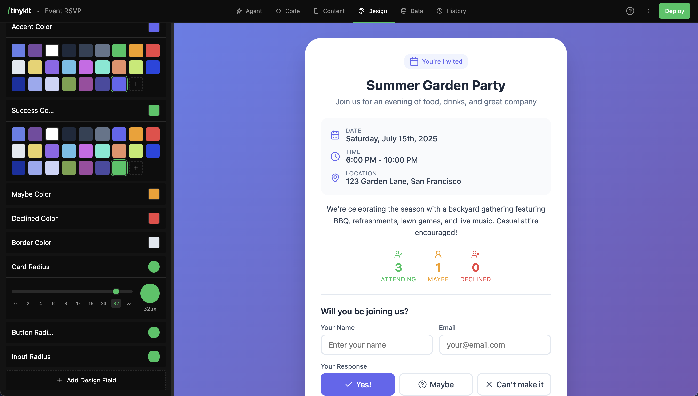
How It Works
- The AI (or you) creates a design field with a name and value
- The field gets a CSS variable (e.g.,
--page-background) - Your code uses the variable:
background: var(--page-background) - The Design tab shows visual editors for each field type
- Changes update the preview instantly
Field Types
Each type has a specialized visual editor:| Type | Editor | Example Values |
|---|---|---|
| color | Color palette picker | #3b82f6, #ffffff |
| size | Slider (0-96px) | 16px, 24px |
| font | Font picker (1000+ fonts) | Inter, Playfair Display |
| radius | Radius slider | 8px, 9999px (full) |
| shadow | Shadow presets | 0 4px 6px rgba(0,0,0,0.1) |
| text | Plain text input | Any custom value |
Using Design Fields
In Your CSS
Always include fallback values:Name to CSS Variable
Field names are converted to kebab-case CSS variables:| Field Name | CSS Variable |
|---|---|
| Page Background | --page-background |
| Card Border Color | --card-border-color |
| Button Hover Background | --button-hover-background |
| Body Font | --body-font |
Color Fields
Color fields use a palette picker with:- Quick-select color chips
- Full color picker
- Hex input
- Theme colors (other colors in your project)
Common Color Fields
Using Colors
Font Fields
Font fields include a picker with 1000+ fonts from Bunny Fonts:Popular Fonts (Quick Select)
| Font | Category |
|---|---|
| Inter | Sans-serif |
| Roboto | Sans-serif |
| Open Sans | Sans-serif |
| Poppins | Sans-serif |
| Montserrat | Sans-serif |
| Playfair Display | Serif |
| Merriweather | Serif |
| JetBrains Mono | Monospace |
| Source Code Pro | Monospace |
Using Fonts
Size Fields
Size fields use a slider from 0-96px. Good for:- Font sizes
- Spacing (padding, margins, gaps)
- Icon sizes
Using Sizes
Radius Fields
Radius fields control border-radius with a visual slider:0px= square corners8px= subtle rounding16px= noticeable rounding9999px= fully rounded (pill/circle)
Using Radius
Shadow Fields
Shadow fields offer preset options:| Preset | Value |
|---|---|
| None | none |
| SM | 0 1px 2px rgba(0,0,0,0.05) |
| MD | 0 4px 6px rgba(0,0,0,0.1) |
| LG | 0 10px 15px rgba(0,0,0,0.1) |
| XL | 0 20px 25px rgba(0,0,0,0.15) |
| Inner | inset 0 2px 4px rgba(0,0,0,0.1) |
Using Shadows
Creating Design Fields
Via the AI
The AI automatically creates design fields when building your app:- Write CSS using variables with fallbacks
- Create design fields for each variable
- Fields appear in the Design tab
Via the Design Tab
- Click Add Design Field at the bottom
- Choose a type (color, size, font, etc.)
- Enter a name (e.g., “Card Background”)
- Set the initial value using the visual editor
- Click Add Field
Workflow: Design Then Code
If you create design fields first, then write CSS:- Add “Card Background” as a color field, set to
#ffffff - The CSS variable
--card-backgroundis now available - Use it in your CSS:
background: var(--card-background, #ffffff)
Best Practices
Use Descriptive Names
Good
- Card Background
- Header Text Color
- Button Hover Background
- Container Padding
Avoid
- Primary Color
- Color 1
- Background
- Size
Consistent Naming Patterns
Start Minimal
Don’t create every possible field upfront. Let the AI add fields as needed, or add them when you actually need customization. A simple app might have 5-10 design fields. A complex app might have 20-30.Dark Mode Pattern
Create paired light/dark fields:Organizing Fields
Design fields appear in the order they’re created. Group related fields by creating them together:FAQ
Can I rename a design field?
Can I rename a design field?
Yes! Click the pencil icon on any field to edit its name and type. The CSS variable will update automatically.
What happens if I delete a field that's used in CSS?
What happens if I delete a field that's used in CSS?
The CSS will fall back to the default value you specified:
var(--deleted-field, fallback). Always use fallbacks.Can I use custom fonts not in the picker?
Can I use custom fonts not in the picker?
Use the “Custom” (text) field type and enter any font-family value. You’ll need to ensure the font is loaded via a
<link> tag or @font-face.How do I use the same color in multiple places?
How do I use the same color in multiple places?
Reference one variable from another:
Can I use design fields in JavaScript?
Can I use design fields in JavaScript?
Yes, read CSS variables with: